


 Ready-to-Wear Line Captures the Art of Convenience")


Bright Ideas in Home Fashion
Spring is the time when the mind wanders to vivid colours, floral patterns and cheerful interior design. Then the thought fades away and we go on living with beige walls, tone-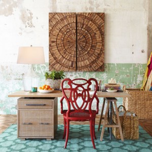 on-tone decor and dark espresso tables. This year, turn your bright ideas into playful home décor. You change your wardrobe seasonally. Why not do the same with your home’s interior fashion? It is easy to do and believe it or not, doesn’t need much more commitment than pillows, rugs, accents, draperies and perhaps a little paint!
Be Odd.
uneven groupings, especially anything in three’s works best when it comes to combining colours and fabrics. Choose three patterns you love and three colours you are attracted to, and go for it! Be conscious to mix pattern scale, from small to large, to make it work.
Maintain your Intensity.
Colour intensity is an essential element to achieving harmony in your space. Do not mix pastel colours with rich jewel tones or bright primary colours. It rarely works. Mixing stripes, checks and floral patterns does work – as long as you choose a range of hues that play nicely together.
Watch your Weight.
As you layout the room, pay extra special attention to where bright colours or heavy patterns are placed. It is easy to end up with a room that looks lopsided or heavy on one 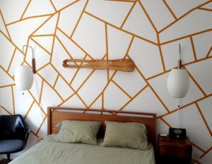 end – and visually, it throws off the balance of your space. Distribute patterned fabrics throughout the room and make sure that strong colours are well balanced within the room.
Patterned fabrics, funky wall treatments, and the bold use of colour have a big impact on how your room feels. If the goal is to pull a room together and create harmony use bigger patterns. If you want to create a focal point in the room and draw attention to it, smaller patterns are more effective.
Easy as 1-2-3
- The Boldest Fabric
statement in your space, the first fabric should feature the largest scale pattern. It will make or break your room.
2. Visually Very Different
from the first fabric choice, and about half the scale. Choose a different pattern (i.e. floral vs. ikat).
3. The Final Pattern
is a visual bridge between your other pattern choices, echoing the same colour palette but with a distinct personality
Get MOODY
The mood of a room is dictated by the interior design within. If you want a space that is high energy – let’s say your family room – look for busy patterns mixed with primary colours. However, if you want to create a room with a calm aura – perhaps your master retreat – choose a sedate colour palette and patterns that create a mood of quiet intrigue. Busy patterns will up the energy level in a room while simple or pale patterns will promote calm.
GO Big and GO Home
Playful décor in your home is easy to achieve if you follow these simple interior design rules. Don’t be afraid to mix it up, bringing life and joy to your space through the use of playful fabrics and vibrant paint colours. Bring fabric swatches and paint samples home and live with them for a few days, before you commit. Many homeowners wisely choose a neutral starting point, such as a sofa, and this is often a safe bet for what is often an  expensive piece of furniture. Go big and make bold pattern and colour choices. Down the road, if you find your pattern and colour changes too overwhelming, you can leave the neutral piece and change out the floral pillows, the colourful bookcase paint or the striped area rug. Don’t let the fear of mixing and matching scare you aware from creating your own version of playful décor.
By: Tracey Drake – NICHE Magazine Spring 2013


